CSS Gradients: The Art of Smooth Color Transitions
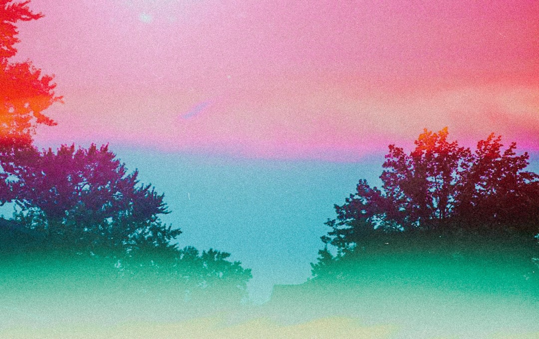
At sunset, the sky transitions smoothly from deep blue to orange-red, then to faint purple at the horizon—these ubiquitous color gradients in nature provide us with the most beautiful visual experiences. In web design, CSS gradients let us create similar smooth color transitions without images, from simple button backgrounds to complex decorative patterns, breathing life and depth into modern web pages.
Why Use Gradients?
Before gradients existed, developers needed to create gradient background images, which increased page load times and maintenance costs. CSS gradients changed everything:
- Superior performance: Pure code implementation, no additional HTTP requests needed
- Infinite scalability: Vector characteristics ensure perfect clarity at any resolution
- Flexible adjustments: Change colors with just a few lines of code
- Animation-friendly: Can work with CSS transitions and animations
Linear Gradients: Color Transitions Along a Line
Linear gradients create color transitions along a straight line, like pulling a rainbow across a canvas.
Basic Syntax
.box {
  background: linear-gradient(direction, color-stop1, color-stop2, ...);
}Simple Top-to-Bottom Gradients
The most basic gradient is a vertical color transition.
/* From top to bottom: blue to white */
.gradient-box {
  background: linear-gradient(#3498db, white);
}

/* Multiple color stops */
.multi-color {
  background: linear-gradient(#e74c3c, #f39c12, #2ecc71);
  /* Red -> Orange -> Green */
}By default, gradients flow from top to bottom (180deg). With multiple colors, they distribute evenly along the gradient line.
Controlling Gradient Direction
You can precisely control gradient direction using keywords or angles.
/* Using direction keywords */
.to-right {
  background: linear-gradient(to right, #3498db, #2ecc71);
  /* From left to right */
}

.to-bottom-right {
  background: linear-gradient(to bottom right, #e74c3c, #f39c12);
  /* From top-left to bottom-right */
}

/* Using angles (0deg is bottom to top) */
.angle-45 {
  background: linear-gradient(45deg, #3498db, #2ecc71);
  /* 45-degree angle, from bottom-left to top-right */
}

.angle-90 {
  background: linear-gradient(90deg, #e74c3c, #f39c12);
  /* 90 degrees, from left to right */
}Angle explanation:
0deg= bottom to top (to top)90deg= left to right (to right)180deg= top to bottom (to bottom, default)270deg= right to left (to left)
Precise Control of Color Stops
Color stops determine where each color appears on the gradient line.
/* Color stops using percentages or length units */
.precise-gradient {
  background: linear-gradient(
    to right,
    #3498db 0%,
    /* Blue on the left */
    #2ecc71 50%,
    /* Green in the middle */
    #f39c12 100%
    /* Orange on the right */
  );
}

/* Create sharp transitions */
.sharp-transition {
  background: linear-gradient(
    to right,
    #3498db 0%,
    #3498db 50%,
    /* First 50% is blue */
    #2ecc71 50%,
    /* Suddenly changes to green at 50% */
    #2ecc71 100%
  );
}

/* Uneven distribution */
.uneven-gradient {
  background: linear-gradient(
    to bottom,
    #e74c3c 0%,
    #f39c12 20%,
    /* Orange takes small portion */
    #2ecc71 100%
    /* Green takes large portion */
  );
}Practical Application: Gradient Buttons
Gradient buttons are very popular in modern UI design:
/* Basic gradient button */
.gradient-button {
  padding: 12px 30px;
  border: none;
  border-radius: 25px;
  color: white;
  font-weight: 600;
  background: linear-gradient(135deg, #667eea 0%, #764ba2 100%);
  cursor: pointer;
  transition: transform 0.2s, box-shadow 0.2s;
}

.gradient-button:hover {
  transform: translateY(-2px);
  box-shadow: 0 8px 20px rgba(102, 126, 234, 0.4);
}

/* Dynamic gradient: changes on hover */
.dynamic-button {
  background: linear-gradient(135deg, #667eea, #764ba2);
  background-size: 200% 200%; /* Background is twice the element size */
  background-position: left;
  transition: background-position 0.5s;
}

.dynamic-button:hover {
  background-position: right; /* Slide to other side */
}Creating Stripe Patterns
By precisely controlling color stops, you can create stripes and patterns.
/* Horizontal stripes */
.horizontal-stripes {
  background: linear-gradient(
    to bottom,
    #3498db 0%,
    #3498db 25%,
    #2ecc71 25%,
    #2ecc71 50%,
    #3498db 50%,
    #3498db 75%,
    #2ecc71 75%,
    #2ecc71 100%
  );
}

/* Diagonal stripes (with background-size for repeating patterns) */
.diagonal-stripes {
  background: linear-gradient(
    45deg,
    #3498db 25%,
    transparent 25%,
    transparent 50%,
    #3498db 50%,
    #3498db 75%,
    transparent 75%,
    transparent
  );
  background-size: 40px 40px; /* Size of repeating unit */
}Radial Gradients: Radiating from Center Outward
Radial gradients radiate outward from a center point, like ripples when a water drop hits a lake or sunlight spreading from the sun.
Basic Syntax
.box {
  background: radial-gradient(
    shape size at position,
    color-stop1,
    color-stop2,
    ...
  );
}Simple Radial Gradients
/* Basic radial gradient: blue from center to green at edges */
.radial-basic {
  background: radial-gradient(#3498db, #2ecc71);
}

/* Multiple colors */
.radial-multi {
  background: radial-gradient(#e74c3c, #f39c12, #2ecc71, #3498db);
}Controlling Shape: Circle or Ellipse
Radial gradients can be circular (circle) or elliptical (ellipse, default).
/* Force circle shape */
.radial-circle {
  background: radial-gradient(circle, #3498db, #2ecc71);
}

/* Elliptical (default, fills entire container) */
.radial-ellipse {
  width: 300px;
  height: 150px;
  background: radial-gradient(ellipse, #e74c3c, #f39c12);
}Controlling Size
You can use keywords or specific dimensions to control gradient size.
/* Using keywords */
.closest-side {
  background: radial-gradient(circle closest-side, #3498db, #2ecc71);
  /* Gradient radius to nearest edge */
}

.closest-corner {
  background: radial-gradient(circle closest-corner, #e74c3c, #f39c12);
  /* Gradient radius to nearest corner */
}

.farthest-side {
  background: radial-gradient(circle farthest-side, #3498db, #2ecc71);
  /* Gradient radius to farthest edge (default) */
}

.farthest-corner {
  background: radial-gradient(circle farthest-corner, #e74c3c, #f39c12);
  /* Gradient radius to farthest corner */
}

/* Using specific dimensions */
.fixed-size {
  background: radial-gradient(circle 100px, #3498db, #2ecc71);
  /* Circle with 100px radius */
}Controlling Position
By default, the gradient center is at the element's center, but you can customize this.
/* Using keyword positioning */
.top-left {
  background: radial-gradient(circle at top left, #3498db, #2ecc71);
}

.center-right {
  background: radial-gradient(circle at right, #e74c3c, #f39c12);
}

/* Using percentages or length values */
.custom-position {
  background: radial-gradient(circle at 30% 40%, #3498db, #2ecc71);
  /* Center at 30% from left, 40% from top */
}

.pixel-position {
  background: radial-gradient(circle at 100px 50px, #e74c3c, #f39c12);
}Practical Application: Spotlight Effects
Radial gradients are perfect for creating spotlights, glows, and other effects.
/* Spotlight effect */
.spotlight {
  position: relative;
  background: #2c3e50;
  color: white;
  padding: 60px;
}

.spotlight::before {
  content: "";
  position: absolute;
  top: 0;
  left: 0;
  width: 100%;
  height: 100%;
  background: radial-gradient(
    circle at 50% 30%,
    rgba(255, 255, 255, 0.15) 0%,
    rgba(255, 255, 255, 0.05) 40%,
    transparent 70%
  );
  pointer-events: none;
}

/* Multiple glows */
.glow-effect {
  background: radial-gradient(
      circle at 30% 30%,
      rgba(52, 152, 219, 0.6),
      transparent 50%
    ),
    radial-gradient(
      circle at 70% 70%,
      rgba(46, 204, 113, 0.6),
      transparent 50%
    ),
    #2c3e50;
}Conic Gradients: Colors Rotating Around Center
Conic gradients (also called angular gradients) transition colors along the circular direction, like color wheels or radar scanning effects.
Basic Syntax
.box {
  background: conic-gradient(
    from angle at position,
    color-stop1,
    color-stop2,
    ...
  );
}Simple Conic Gradients
/* Basic conic gradient */
.conic-basic {
  background: conic-gradient(#3498db, #2ecc71, #f39c12, #e74c3c, #3498db);
  /* Starts with blue, transitions clockwise, returns to blue to close loop */
}

/* Color wheel effect */
.color-wheel {
  width: 200px;
  height: 200px;
  border-radius: 50%;
  background: conic-gradient(
    red,
    orange,
    yellow,
    lime,
    cyan,
    blue,
    magenta,
    red
  );
}Controlling Starting Angle
By default, starts from the top (0 degrees), but you can customize the starting angle.
/* Start from right (90 degrees) */
.from-right {
  background: conic-gradient(from 90deg, #3498db, #2ecc71, #3498db);
}

/* Start from left (270 degrees) */
.from-left {
  background: conic-gradient(from 270deg, #e74c3c, #f39c12, #e74c3c);
}Controlling Color Stops
Use angles or percentages to define color positions on the circle.
/* Using angles */
.angle-stops {
  background: conic-gradient(
    #3498db 0deg,
    #3498db 90deg,
    #2ecc71 90deg,
    #2ecc71 180deg,
    #f39c12 180deg,
    #f39c12 270deg,
    #e74c3c 270deg,
    #e74c3c 360deg
  );
}

/* Using percentages */
.percentage-stops {
  background: conic-gradient(
    #3498db 0%,
    #3498db 25%,
    #2ecc71 25%,
    #2ecc71 50%,
    #f39c12 50%,
    #f39c12 75%,
    #e74c3c 75%,
    #e74c3c 100%
  );
}Practical Application: Pie Charts and Loaders
Conic gradients are perfect for creating pie charts, progress rings, loading animations, etc.
/* Simple pie chart */
.pie-chart {
  width: 200px;
  height: 200px;
  border-radius: 50%;
  background: conic-gradient(
    #3498db 0% 35%,
    /* 35% blue */
    #2ecc71 35% 65%,
    /* 30% green */
    #f39c12 65% 85%,
    /* 20% orange */
    #e74c3c 85% 100%
    /* 15% red */
  );
}

/* Progress ring */
.progress-ring {
  width: 150px;
  height: 150px;
  border-radius: 50%;
  background: conic-gradient(#3498db 0% 75%, #ecf0f1 75% 100%);
  /* 75% progress */
  position: relative;
}

.progress-ring::before {
  content: "75%";
  position: absolute;
  top: 50%;
  left: 50%;
  transform: translate(-50%, -50%);
  font-size: 32px;
  font-weight: 700;
}

/* Rotating loader */
.spinner {
  width: 50px;
  height: 50px;
  border-radius: 50%;
  background: conic-gradient(
    transparent 0deg,
    transparent 270deg,
    #3498db 360deg
  );
  animation: spin 1s linear infinite;
}

@keyframes spin {
  to {
    transform: rotate(360deg);
  }
}Repeating Gradients: Creating Patterns
CSS provides repeating versions of all three gradients for creating repeating patterns.
Repeating Linear Gradients
/* Basic repetition */
.repeating-linear {
  background: repeating-linear-gradient(
    45deg,
    #3498db,
    #3498db 10px,
    #2ecc71 10px,
    #2ecc71 20px
  );
  /* Repeats blue-green stripes every 20px */
}

/* Progress bar background */
.progress-bar {
  background: repeating-linear-gradient(
    -45deg,
    #3498db,
    #3498db 10px,
    #2980b9 10px,
    #2980b9 20px
  );
}

/* Warning stripes */
.warning-stripes {
  background: repeating-linear-gradient(
    45deg,
    #f39c12,
    #f39c12 15px,
    #2c3e50 15px,
    #2c3e50 30px
  );
}Repeating Radial Gradients
/* Concentric circle pattern */
.concentric-circles {
  background: repeating-radial-gradient(
    circle,
    #3498db,
    #3498db 10px,
    #2ecc71 10px,
    #2ecc71 20px
  );
}

/* Target effect */
.target {
  width: 200px;
  height: 200px;
  border-radius: 50%;
  background: repeating-radial-gradient(
    circle,
    #e74c3c,
    #e74c3c 20px,
    white 20px,
    white 40px
  );
}Repeating Conic Gradients
/* Radial checkerboard */
.radial-checkerboard {
  background: repeating-conic-gradient(
    #3498db 0deg 90deg,
    #2ecc71 90deg 180deg
  );
}

/* Radar scanning effect */
.radar {
  width: 200px;
  height: 200px;
  border-radius: 50%;
  background: repeating-conic-gradient(
    from 0deg,
    rgba(52, 152, 219, 0.8) 0deg 30deg,
    rgba(52, 152, 219, 0.3) 30deg 60deg
  );
  animation: rotate 3s linear infinite;
}

@keyframes rotate {
  to {
    transform: rotate(360deg);
  }
}Combining Multiple Gradients
CSS allows layering multiple gradients to create complex effects. Gradients render from top to bottom in declaration order.
/* Double layer linear gradient */
.layered-gradient {
  background: linear-gradient(45deg, rgba(52, 152, 219, 0.8), transparent),
    linear-gradient(-45deg, rgba(46, 204, 113, 0.8), transparent);
  background-color: #ecf0f1; /* Base color */
}

/* Grid pattern */
.grid-pattern {
  background: linear-gradient(rgba(0, 0, 0, 0.1) 1px, transparent 1px),
    linear-gradient(90deg, rgba(0, 0, 0, 0.1) 1px, transparent 1px);
  background-size: 20px 20px;
  background-color: white;
}

/* Light ray effect */
.light-rays {
  background: radial-gradient(
      ellipse at top,
      rgba(255, 255, 255, 0.3),
      transparent
    ),
    linear-gradient(to bottom, #667eea, #764ba2);
}

/* Complex decorative background */
.decorative-bg {
  background: radial-gradient(
      circle at 20% 30%,
      rgba(52, 152, 219, 0.3),
      transparent 50%
    ),
    radial-gradient(
      circle at 80% 70%,
      rgba(231, 76, 60, 0.3),
      transparent 50%
    ),
    linear-gradient(135deg, #667eea 0%, #764ba2 100%);
}Practical Case Study: Modern Card with Gradient Background
Let's create a beautiful card with gradient background:
<div class="gradient-card">
  <div class="card-content">
    <h2>Premium Plan</h2>
    <p class="price">$29<span>/month</span></p>
    <ul class="features">
      <li>Unlimited Projects</li>
      <li>Priority Support</li>
      <li>Advanced Analytics</li>
    </ul>
    <button class="subscribe-btn">Subscribe Now</button>
  </div>
</div>.gradient-card {
width: 350px;
min-height: 400px;
border-radius: 20px;
padding: 2px; /* Space for gradient border */
background: linear-gradient(135deg, #667eea 0%, #764ba2 100%);
position: relative;
overflow: hidden;
}
/* Create inner white background */
.gradient-card::before {
content: "";
position: absolute;
top: 2px;
left: 2px;
right: 2px;
bottom: 2px;
background: white;
border-radius: 18px;
z-index: 1;
}
/* Decorative background halo */
.gradient-card::after {
content: "";
position: absolute;
width: 200px;
height: 200px;
border-radius: 50%;
background: radial-gradient(
circle,
rgba(102, 126, 234, 0.2),
transparent 70%
);
top: -50px;
right: -50px;
z-index: 2;
}
.card-content {
position: relative;
z-index: 3;
padding: 40px 30px;
}
.gradient-card h2 {
margin: 0 0 20px 0;
font-size: 28px;
background: linear-gradient(135deg, #667eea, #764ba2);
-webkit-background-clip: text;
background-clip: text;
-webkit-text-fill-color: transparent;
}
.price {
font-size: 48px;
font-weight: 700;
color: #2c3e50;
margin-bottom: 30px;
}
.price span {
font-size: 18px;
color: #7f8c8d;
}
.features {
list-style: none;
padding: 0;
margin: 0 0 30px 0;
}
.features li {
padding: 10px 0;
color: #2c3e50;
border-bottom: 1px solid #ecf0f1;
}
.subscribe-btn {
width: 100%;
padding: 15px;
border: none;
border-radius: 10px;
background: linear-gradient(135deg, #667eea, #764ba2);
color: white;
font-weight: 600;
font-size: 16px;
cursor: pointer;
transition: transform 0.2s, box-shadow 0.2s;
}
.subscribe-btn:hover {
transform: translateY(-2px);
box-shadow: 0 10px 25px rgba(102, 126, 234, 0.3);
}Gradient Text: Creating Colored Text
While background properties can't be applied directly to text, you can achieve gradient text using the background-clip trick.
.gradient-text {
  font-size: 48px;
  font-weight: 700;
  background: linear-gradient(135deg, #667eea, #764ba2);
  -webkit-background-clip: text;
  background-clip: text;
  -webkit-text-fill-color: transparent;
  color: transparent; /* Fallback for compatibility */
}

/* Dynamic gradient text */
.animated-gradient-text {
  font-size: 48px;
  font-weight: 700;
  background: linear-gradient(90deg, #667eea, #764ba2, #f093fb, #667eea);
  background-size: 300% 100%;
  -webkit-background-clip: text;
  background-clip: text;
  -webkit-text-fill-color: transparent;
  animation: gradient-shift 3s ease infinite;
}

@keyframes gradient-shift {
  0%,
  100% {
    background-position: 0% 50%;
  }
  50% {
    background-position: 100% 50%;
  }
}Gradients and Transparency: Creating Depth
Combining gradients with transparency can create more refined visual effects.
/* Glassmorphism effect */
.glass-card {
  background: linear-gradient(
    135deg,
    rgba(255, 255, 255, 0.7),
    rgba(255, 255, 255, 0.3)
  );
  backdrop-filter: blur(10px);
  border: 1px solid rgba(255, 255, 255, 0.3);
  border-radius: 20px;
  padding: 30px;
}

/* Fade-out effect */
.fade-out {
  background: linear-gradient(to bottom, rgba(44, 62, 80, 1), transparent);
}

/* Overlay layer */
.overlay {
  position: absolute;
  top: 0;
  left: 0;
  width: 100%;
  height: 100%;
  background: linear-gradient(
    to bottom,
    rgba(0, 0, 0, 0) 0%,
    rgba(0, 0, 0, 0.7) 100%
  );
}Performance and Best Practices
Avoid Overly Complex Gradients
/* ❌ Avoid: Too many color stops */
.heavy-gradient {
  background: linear-gradient(
    to right,
    #f00 0%,
    #f10 5%,
    #f20 10%,
    /* ...50 more stops... */
  );
}

/* ✅ Recommended: Simple and effective */
.optimized-gradient {
  background: linear-gradient(to right, #667eea, #764ba2);
}Use Semi-transparent Colors for Layering
/* ✅ Semi-transparent overlay is more flexible */
.layered-bg {
  background: linear-gradient(
      135deg,
      rgba(102, 126, 234, 0.9),
      rgba(118, 75, 162, 0.9)
    ),
    url("background.jpg");
  background-size: cover;
}Ensure Text Contrast
/* ⚠️ Ensure text readability */
.readable-text {
  background: linear-gradient(135deg, #667eea, #764ba2);
  color: white; /* Use light text on dark background */
  padding: 20px;
}Common Issues and Solutions
Issue 1: Gradients Displaying Abnormally in Safari
Some older Safari versions may need -webkit- prefixes.
/* Add browser prefixes */
.gradient-box {
  background: -webkit-linear-gradient(135deg, #667eea, #764ba2);
  background: linear-gradient(135deg, #667eea, #764ba2);
}Issue 2: Gradient Borders Clipped by Rounded Corners
Use pseudo-element techniques to create gradient borders.
.gradient-border {
  position: relative;
  background: white;
  border-radius: 20px;
  padding: 20px;
}

.gradient-border::before {
  content: "";
  position: absolute;
  top: 0;
  left: 0;
  right: 0;
  bottom: 0;
  border-radius: 20px;
  padding: 2px; /* Border width */
  background: linear-gradient(135deg, #667eea, #764ba2);
  -webkit-mask: linear-gradient(#fff 0 0) content-box, linear-gradient(#fff 0 0);
  mask: linear-gradient(#fff 0 0) content-box, linear-gradient(#fff 0 0);
  -webkit-mask-composite: xor;
  mask-composite: exclude;
  z-index: -1;
}Summary
CSS gradients are indispensable tools in modern web design, enabling us to create rich visual effects:
- Linear gradients: Most commonly used, suitable for backgrounds, buttons, dividers
- Radial gradients: Create spotlights, glows, and radiation effects
- Conic gradients: Perfect for pie charts, progress rings, color wheels
- Repeating gradients: Generate stripes, patterns, and textures
When using gradients, remember:
- Simplicity first: 2-3 colors are usually more elegant than 10
- Consistent direction: Maintain gradient direction consistency within the same design
- Performance aware: Simple gradients perform better than complex images
- Accessibility: Ensure text contrast meets standards