CSS 渐变效果:从纯色到多彩过渡的艺术
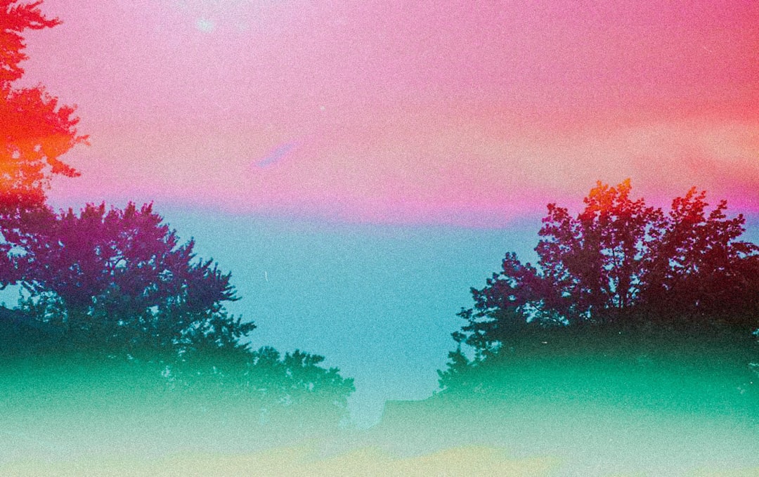
日落时分,天空从深蓝逐渐过渡到橙红,再到地平线处的淡紫——这种自然界中无处不在的颜色渐变,为我们提供了最美丽的视觉体验。在网页设计中,CSS 渐变让我们无需图片就能创造类似的流畅色彩过渡,从简单的按钮背景到复杂的装饰图案,渐变为现代网页注入了生机与深度。
为什么使用渐变?
在渐变出现之前,开发者需要创建渐变背景图片,这会增加页面加载时间和维护成本。CSS 渐变改变了这一切:
- 性能优越:纯代码实现,无需额外 HTTP 请求
- 无限缩放:矢量特性,任何分辨率下都完美清晰
- 灵活调整:修改颜色只需改几行代码
- 动画友好:可以与 CSS 过渡和动画配合
线性渐变:沿直线的颜色过渡
线性渐变沿着一条直线(渐变线)从一种颜色平滑过渡到另一种颜色,就像用画笔在画布上拉出一道彩虹。
基础语法
.box {
  background: linear-gradient(direction, color-stop1, color-stop2, ...);
}简单的上下渐变
最基础的渐变是垂直方向的颜色过渡。
/* 从上到下:从蓝色到白色 */
.gradient-box {
  background: linear-gradient(#3498db, white);
}

/* 多个颜色停靠点 */
.multi-color {
  background: linear-gradient(#e74c3c, #f39c12, #2ecc71);
  /* 红色 -> 橙色 -> 绿色 */
}默认情况下,渐变从上到下进行(180deg)。如果有多个颜色,它们会均匀分布在渐变线上。
控制渐变方向
你可以精确控制渐变的方向,使用关键词或角度。
/* 使用方向关键词 */
.to-right {
  background: linear-gradient(to right, #3498db, #2ecc71);
  /* 从左到右 */
}

.to-bottom-right {
  background: linear-gradient(to bottom right, #e74c3c, #f39c12);
  /* 从左上角到右下角 */
}

/* 使用角度(0deg 是从下到上) */
.angle-45 {
  background: linear-gradient(45deg, #3498db, #2ecc71);
  /* 45度角,从左下到右上 */
}

.angle-90 {
  background: linear-gradient(90deg, #e74c3c, #f39c12);
  /* 90度,从左到右 */
}角度说明:
0deg= 从下到上(to top)90deg= 从左到右(to right)180deg= 从上到下(to bottom,默认)270deg= 从右到左(to left)
精确控制颜色停靠点
颜色停靠点(color stop)决定了每种颜色在渐变线上的位置。
/* 颜色停靠点用百分比或长度单位 */
.precise-gradient {
  background: linear-gradient(
    to right,
    #3498db 0%,
    /* 左侧是蓝色 */ #2ecc71 50%,
    /* 中间是绿色 */ #f39c12 100% /* 右侧是橙色 */
  );
}

/* 创建突变效果 */
.sharp-transition {
  background: linear-gradient(
    to right,
    #3498db 0%,
    #3498db 50%,
    /* 前50%都是蓝色 */ #2ecc71 50%,
    /* 从50%突然变为绿色 */ #2ecc71 100%
  );
}

/* 不均匀分布 */
.uneven-gradient {
  background: linear-gradient(
    to bottom,
    #e74c3c 0%,
    #f39c12 20%,
    /* 橙色只占小部分 */ #2ecc71 100% /* 绿色占大部分 */
  );
}实际应用:按钮渐变
现代 UI 设计中,渐变按钮非常流行:
/* 基础渐变按钮 */
.gradient-button {
  padding: 12px 30px;
  border: none;
  border-radius: 25px;
  color: white;
  font-weight: 600;
  background: linear-gradient(135deg, #667eea 0%, #764ba2 100%);
  cursor: pointer;
  transition: transform 0.2s, box-shadow 0.2s;
}

.gradient-button:hover {
  transform: translateY(-2px);
  box-shadow: 0 8px 20px rgba(102, 126, 234, 0.4);
}

/* 动态渐变:悬停时改变 */
.dynamic-button {
  background: linear-gradient(135deg, #667eea, #764ba2);
  background-size: 200% 200%; /* 背景大小是元素的两倍 */
  background-position: left;
  transition: background-position 0.5s;
}

.dynamic-button:hover {
  background-position: right; /* 滑动到另一侧 */
}创建条纹图案
通过精确控制颜色停靠点,可以创建条纹和图案。
/* 水平条纹 */
.horizontal-stripes {
  background: linear-gradient(
    to bottom,
    #3498db 0%,
    #3498db 25%,
    #2ecc71 25%,
    #2ecc71 50%,
    #3498db 50%,
    #3498db 75%,
    #2ecc71 75%,
    #2ecc71 100%
  );
}

/* 斜条纹(配合 background-size 创建重复图案) */
.diagonal-stripes {
  background: linear-gradient(
    45deg,
    #3498db 25%,
    transparent 25%,
    transparent 50%,
    #3498db 50%,
    #3498db 75%,
    transparent 75%,
    transparent
  );
  background-size: 40px 40px; /* 重复单元的大小 */
}径向渐变:从中心向外扩散
径向渐变从一个中心点向外辐射,就像水滴落入湖面产生的涟漪,或是太阳光芒向四周发散。
基础语法
.box {
  background: radial-gradient(
    shape size at position,
    color-stop1,
    color-stop2,
    ...
  );
}简单的径向渐变
/* 基础径向渐变:从中心的蓝色到边缘的绿色 */
.radial-basic {
  background: radial-gradient(#3498db, #2ecc71);
}

/* 多个颜色 */
.radial-multi {
  background: radial-gradient(#e74c3c, #f39c12, #2ecc71, #3498db);
}控制形状:圆形或椭圆形
径向渐变可以是圆形(circle)或椭圆形(ellipse,默认)。
/* 强制圆形 */
.radial-circle {
  background: radial-gradient(circle, #3498db, #2ecc71);
}

/* 椭圆形(默认,会填充整个容器) */
.radial-ellipse {
  width: 300px;
  height: 150px;
  background: radial-gradient(ellipse, #e74c3c, #f39c12);
}控制大小
可以使用关键词或具体尺寸控制渐变的大小。
/* 使用关键词 */
.closest-side {
  background: radial-gradient(circle closest-side, #3498db, #2ecc71);
  /* 渐变半径到最近的边 */
}

.closest-corner {
  background: radial-gradient(circle closest-corner, #e74c3c, #f39c12);
  /* 渐变半径到最近的角 */
}

.farthest-side {
  background: radial-gradient(circle farthest-side, #3498db, #2ecc71);
  /* 渐变半径到最远的边(默认) */
}

.farthest-corner {
  background: radial-gradient(circle farthest-corner, #e74c3c, #f39c12);
  /* 渐变半径到最远的角 */
}

/* 使用具体尺寸 */
.fixed-size {
  background: radial-gradient(circle 100px, #3498db, #2ecc71);
  /* 圆形半径100px */
}控制位置
默认情况下,渐变中心在元素中央,但可以自定义位置。
/* 使用关键词定位 */
.top-left {
  background: radial-gradient(circle at top left, #3498db, #2ecc71);
}

.center-right {
  background: radial-gradient(circle at right, #e74c3c, #f39c12);
}

/* 使用百分比或长度值 */
.custom-position {
  background: radial-gradient(circle at 30% 40%, #3498db, #2ecc71);
  /* 中心在距左侧30%、距顶部40%的位置 */
}

.pixel-position {
  background: radial-gradient(circle at 100px 50px, #e74c3c, #f39c12);
}实际应用:聚光灯效果
径向渐变非常适合创建聚光灯、光晕等效果。
/* 聚光灯效果 */
.spotlight {
  position: relative;
  background: #2c3e50;
  color: white;
  padding: 60px;
}

.spotlight::before {
  content: "";
  position: absolute;
  top: 0;
  left: 0;
  width: 100%;
  height: 100%;
  background: radial-gradient(
    circle at 50% 30%,
    rgba(255, 255, 255, 0.15) 0%,
    rgba(255, 255, 255, 0.05) 40%,
    transparent 70%
  );
  pointer-events: none;
}

/* 多重光晕 */
.glow-effect {
  background: radial-gradient(
      circle at 30% 30%,
      rgba(52, 152, 219, 0.6),
      transparent 50%
    ), radial-gradient(
      circle at 70% 70%,
      rgba(46, 204, 113, 0.6),
      transparent 50%
    ), #2c3e50;
}锥形渐变:围绕中心旋转的颜色
锥形渐变(也叫角度渐变)沿着圆周方向过渡颜色,就像色轮或雷达扫描效果。
基础语法
.box {
  background: conic-gradient(
    from angle at position,
    color-stop1,
    color-stop2,
    ...
  );
}简单的锥形渐变
/* 基础锥形渐变 */
.conic-basic {
  background: conic-gradient(#3498db, #2ecc71, #f39c12, #e74c3c, #3498db);
  /* 从蓝色开始,顺时针过渡,最后回到蓝色形成闭环 */
}

/* 色轮效果 */
.color-wheel {
  width: 200px;
  height: 200px;
  border-radius: 50%;
  background: conic-gradient(
    red,
    orange,
    yellow,
    lime,
    cyan,
    blue,
    magenta,
    red
  );
}控制起始角度
默认从顶部(0 度)开始,可以自定义起始角度。
/* 从右侧开始(90度) */
.from-right {
  background: conic-gradient(from 90deg, #3498db, #2ecc71, #3498db);
}

/* 从左侧开始(270度) */
.from-left {
  background: conic-gradient(from 270deg, #e74c3c, #f39c12, #e74c3c);
}控制颜色停靠点
使用角度或百分比定义颜色在圆周上的位置。
/* 使用角度 */
.angle-stops {
  background: conic-gradient(
    #3498db 0deg,
    #3498db 90deg,
    #2ecc71 90deg,
    #2ecc71 180deg,
    #f39c12 180deg,
    #f39c12 270deg,
    #e74c3c 270deg,
    #e74c3c 360deg
  );
}

/* 使用百分比 */
.percentage-stops {
  background: conic-gradient(
    #3498db 0%,
    #3498db 25%,
    #2ecc71 25%,
    #2ecc71 50%,
    #f39c12 50%,
    #f39c12 75%,
    #e74c3c 75%,
    #e74c3c 100%
  );
}实际应用:饼图和加载器
锥形渐变非常适合创建饼图、进度环、加载动画等。
/* 简单饼图 */
.pie-chart {
  width: 200px;
  height: 200px;
  border-radius: 50%;
  background: conic-gradient(
    #3498db 0% 35%,
    /* 35% 蓝色 */ #2ecc71 35% 65%,
    /* 30% 绿色 */ #f39c12 65% 85%,
    /* 20% 橙色 */ #e74c3c 85% 100% /* 15% 红色 */
  );
}

/* 进度环 */
.progress-ring {
  width: 150px;
  height: 150px;
  border-radius: 50%;
  background: conic-gradient(#3498db 0% 75%, #ecf0f1 75% 100%);
  /* 75% 进度 */
  position: relative;
}

.progress-ring::before {
  content: "75%";
  position: absolute;
  top: 50%;
  left: 50%;
  transform: translate(-50%, -50%);
  font-size: 32px;
  font-weight: 700;
}

/* 旋转加载器 */
.spinner {
  width: 50px;
  height: 50px;
  border-radius: 50%;
  background: conic-gradient(
    transparent 0deg,
    transparent 270deg,
    #3498db 360deg
  );
  animation: spin 1s linear infinite;
}

@keyframes spin {
  to {
    transform: rotate(360deg);
  }
}重复渐变:创建图案
CSS 提供了重复版本的三种渐变,用于创建重复图案。
重复线性渐变
/* 基础重复 */
.repeating-linear {
  background: repeating-linear-gradient(
    45deg,
    #3498db,
    #3498db 10px,
    #2ecc71 10px,
    #2ecc71 20px
  );
  /* 每20px重复一次蓝绿条纹 */
}

/* 进度条背景 */
.progress-bar {
  background: repeating-linear-gradient(
    -45deg,
    #3498db,
    #3498db 10px,
    #2980b9 10px,
    #2980b9 20px
  );
}

/* 警告条纹 */
.warning-stripes {
  background: repeating-linear-gradient(
    45deg,
    #f39c12,
    #f39c12 15px,
    #2c3e50 15px,
    #2c3e50 30px
  );
}重复径向渐变
/* 同心圆图案 */
.concentric-circles {
  background: repeating-radial-gradient(
    circle,
    #3498db,
    #3498db 10px,
    #2ecc71 10px,
    #2ecc71 20px
  );
}

/* 瞄准器效果 */
.target {
  width: 200px;
  height: 200px;
  border-radius: 50%;
  background: repeating-radial-gradient(
    circle,
    #e74c3c,
    #e74c3c 20px,
    white 20px,
    white 40px
  );
}重复锥形渐变
/* 放射状棋盘 */
.radial-checkerboard {
  background: repeating-conic-gradient(
    #3498db 0deg 90deg,
    #2ecc71 90deg 180deg
  );
}

/* 雷达扫描效果 */
.radar {
  width: 200px;
  height: 200px;
  border-radius: 50%;
  background: repeating-conic-gradient(
    from 0deg,
    rgba(52, 152, 219, 0.8) 0deg 30deg,
    rgba(52, 152, 219, 0.3) 30deg 60deg
  );
  animation: rotate 3s linear infinite;
}

@keyframes rotate {
  to {
    transform: rotate(360deg);
  }
}组合多个渐变
CSS 允许叠加多个渐变,创造复杂效果。渐变按声明顺序从上到下渲染。
/* 双层线性渐变 */
.layered-gradient {
  background: linear-gradient(45deg, rgba(52, 152, 219, 0.8), transparent),
    linear-gradient(-45deg, rgba(46, 204, 113, 0.8), transparent);
  background-color: #ecf0f1; /* 底色 */
}

/* 网格图案 */
.grid-pattern {
  background: linear-gradient(rgba(0, 0, 0, 0.1) 1px, transparent 1px),
    linear-gradient(90deg, rgba(0, 0, 0, 0.1) 1px, transparent 1px);
  background-size: 20px 20px;
  background-color: white;
}

/* 光线效果 */
.light-rays {
  background: radial-gradient(
      ellipse at top,
      rgba(255, 255, 255, 0.3),
      transparent
    ), linear-gradient(to bottom, #667eea, #764ba2);
}

/* 复杂装饰背景 */
.decorative-bg {
  background: radial-gradient(
      circle at 20% 30%,
      rgba(52, 152, 219, 0.3),
      transparent 50%
    ), radial-gradient(
      circle at 80% 70%,
      rgba(231, 76, 60, 0.3),
      transparent 50%
    ), linear-gradient(135deg, #667eea 0%, #764ba2 100%);
}实战案例:现代卡片背景
让我们创建一个具有渐变背景的精美卡片:
<div class="gradient-card">
  <div class="card-content">
    <h2>Premium Plan</h2>
    <p class="price">$29<span>/month</span></p>
    <ul class="features">
      <li>Unlimited Projects</li>
      <li>Priority Support</li>
      <li>Advanced Analytics</li>
    </ul>
    <button class="subscribe-btn">Subscribe Now</button>
  </div>
</div>.gradient-card {
width: 350px;
min-height: 400px;
border-radius: 20px;
padding: 2px; /* 为渐变边框留空间 */
background: linear-gradient(135deg, #667eea 0%, #764ba2 100%);
position: relative;
overflow: hidden;
}
/* 创建内部白色背景 */
.gradient-card::before {
content: "";
position: absolute;
top: 2px;
left: 2px;
right: 2px;
bottom: 2px;
background: white;
border-radius: 18px;
z-index: 1;
}
/* 装饰性背景光晕 */
.gradient-card::after {
content: "";
position: absolute;
width: 200px;
height: 200px;
border-radius: 50%;
background: radial-gradient(
circle,
rgba(102, 126, 234, 0.2),
transparent 70%
);
top: -50px;
right: -50px;
z-index: 2;
}
.card-content {
position: relative;
z-index: 3;
padding: 40px 30px;
}
.gradient-card h2 {
margin: 0 0 20px 0;
font-size: 28px;
background: linear-gradient(135deg, #667eea, #764ba2);
-webkit-background-clip: text;
background-clip: text;
-webkit-text-fill-color: transparent;
}
.price {
font-size: 48px;
font-weight: 700;
color: #2c3e50;
margin-bottom: 30px;
}
.price span {
font-size: 18px;
color: #7f8c8d;
}
.features {
list-style: none;
padding: 0;
margin: 0 0 30px 0;
}
.features li {
padding: 10px 0;
color: #2c3e50;
border-bottom: 1px solid #ecf0f1;
}
.subscribe-btn {
width: 100%;
padding: 15px;
border: none;
border-radius: 10px;
background: linear-gradient(135deg, #667eea, #764ba2);
color: white;
font-weight: 600;
font-size: 16px;
cursor: pointer;
transition: transform 0.2s, box-shadow 0.2s;
}
.subscribe-btn:hover {
transform: translateY(-2px);
box-shadow: 0 10px 25px rgba(102, 126, 234, 0.3);
}渐变文本:创造彩色文字
虽然 background 属性不能直接应用于文本,但可以通过 background-clip 技巧实现渐变文字。
.gradient-text {
  font-size: 48px;
  font-weight: 700;
  background: linear-gradient(135deg, #667eea, #764ba2);
  -webkit-background-clip: text;
  background-clip: text;
  -webkit-text-fill-color: transparent;
  color: transparent; /* 兼容性后备 */
}

/* 动态渐变文字 */
.animated-gradient-text {
  font-size: 48px;
  font-weight: 700;
  background: linear-gradient(90deg, #667eea, #764ba2, #f093fb, #667eea);
  background-size: 300% 100%;
  -webkit-background-clip: text;
  background-clip: text;
  -webkit-text-fill-color: transparent;
  animation: gradient-shift 3s ease infinite;
}

@keyframes gradient-shift {
  0%,
  100% {
    background-position: 0% 50%;
  }
  50% {
    background-position: 100% 50%;
  }
}渐变与透明度:创造深度
结合透明度可以创造更精致的视觉效果。
/* 玻璃态效果(Glassmorphism) */
.glass-card {
  background: linear-gradient(
    135deg,
    rgba(255, 255, 255, 0.7),
    rgba(255, 255, 255, 0.3)
  );
  backdrop-filter: blur(10px);
  border: 1px solid rgba(255, 255, 255, 0.3);
  border-radius: 20px;
  padding: 30px;
}

/* 渐隐效果 */
.fade-out {
  background: linear-gradient(to bottom, rgba(44, 62, 80, 1), transparent);
}

/* 遮罩层 */
.overlay {
  position: absolute;
  top: 0;
  left: 0;
  width: 100%;
  height: 100%;
  background: linear-gradient(
    to bottom,
    rgba(0, 0, 0, 0) 0%,
    rgba(0, 0, 0, 0.7) 100%
  );
}性能与最佳实践
避免过度复杂的渐变
/* ❌ 避免:过多颜色停靠点 */
.heavy-gradient {
  background: linear-gradient(
    to right,
    #f00 0%,
    #f10 5%,
    #f20 10%,
    /* ...50 more stops... */
  );
}

/* ✅ 推荐:简洁有效 */
.optimized-gradient {
  background: linear-gradient(to right, #667eea, #764ba2);
}使用半透明色创造层次
/* ✅ 半透明叠加更灵活 */
.layered-bg {
  background: linear-gradient(
      135deg,
      rgba(102, 126, 234, 0.9),
      rgba(118, 75, 162, 0.9)
    ), url("background.jpg");
  background-size: cover;
}确保文本对比度
/* ⚠️ 确保文字可读 */
.readable-text {
  background: linear-gradient(135deg, #667eea, #764ba2);
  color: white; /* 深色背景用浅色文字 */
  padding: 20px;
}常见问题与解决方案
问题 1:渐变在 Safari 中显示异常
某些老版本 Safari 需要 -webkit- 前缀。
/* 添加浏览器前缀 */
.gradient-box {
  background: -webkit-linear-gradient(135deg, #667eea, #764ba2);
  background: linear-gradient(135deg, #667eea, #764ba2);
}问题 2:渐变边框被圆角裁剪
使用伪元素技巧创建渐变边框。
.gradient-border {
  position: relative;
  background: white;
  border-radius: 20px;
  padding: 20px;
}

.gradient-border::before {
  content: "";
  position: absolute;
  top: 0;
  left: 0;
  right: 0;
  bottom: 0;
  border-radius: 20px;
  padding: 2px; /* 边框宽度 */
  background: linear-gradient(135deg, #667eea, #764ba2);
  -webkit-mask: linear-gradient(#fff 0 0) content-box, linear-gradient(#fff 0 0);
  mask: linear-gradient(#fff 0 0) content-box, linear-gradient(#fff 0 0);
  -webkit-mask-composite: xor;
  mask-composite: exclude;
  z-index: -1;
}总结
CSS 渐变是现代网页设计中不可或缺的工具,它让我们能够创造丰富的视觉效果:
- 线性渐变:最常用,适合背景、按钮、分隔线
- 径向渐变:创造聚光灯、光晕、辐射效果
- 锥形渐变:适合饼图、进度环、色轮
- 重复渐变:生成条纹、图案、纹理
使用渐变时要记住:
- 简洁优先:2-3 种颜色通常比 10 种颜色更优雅
- 方向一致:同一设计中保持渐变方向的统一性
- 性能意识:简单的渐变比复杂图片性能更好
- 可访问性:确保文本对比度符合标准