Grid Container Properties: Mastering the Core of Grid Layout
Imagine you are a city planner designing the street layout for a new district. You need to decide how many avenues (columns) there are, how many streets (rows) there are, how wide the streets are, how large the gaps between buildings are, and how buildings align within their plots. Grid container properties are like the planning tools in your hand, allowing you to precisely control the structure and layout rules of the entire grid.
In the previous chapter, we learned the basic concepts of Grid Layout. Now, let's dive deep into the various properties of the Grid container, which are the core of controlling the entire grid layout.
Defining Grid Structure
First, we need to define the basic structure of the grid—how many columns, how many rows, how wide each column is, and how high each row is.
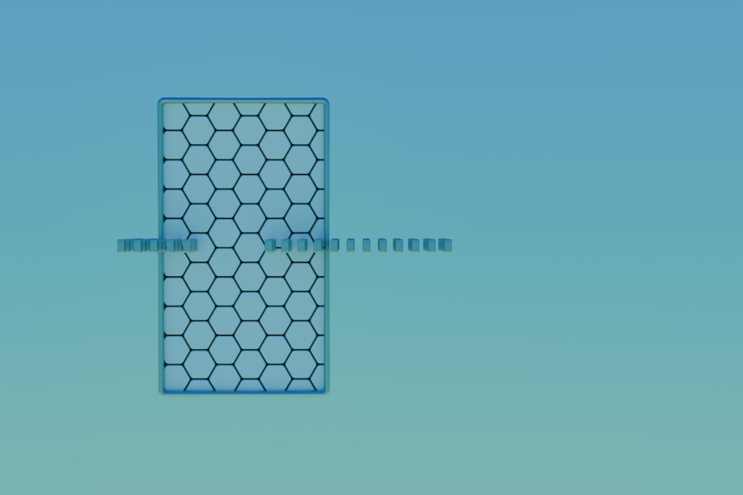
grid-template-columns: Defining Column Structure
The grid-template-columns property defines how many columns the grid has and the width of each column. This is one of the most important properties in Grid Layout.
Fixed Width Columns
The simplest way is to use fixed widths:
.grid {
  display: grid;
  grid-template-columns: 200px 300px 400px; /* Three columns with widths 200px, 300px, 400px */
}If the container width is 900px, these three columns fit perfectly. If the container is wider, there will be empty space on the right; if narrower, the grid will overflow.
Flexible fr Unit
The fr unit makes the grid flexible; it represents "a fraction of the available space":
.grid {
  display: grid;
  grid-template-columns: 1fr 1fr 1fr; /* Three columns sharing space equally */
}Assuming the container width is 900px:
- Total 3 parts (1 + 1 + 1)
- Each part = 900px ÷ 3 = 300px
- All three columns are 300px
You can use different fr values to create different proportions:
.grid {
  display: grid;
  grid-template-columns: 2fr 1fr 1fr; /* First column is twice as wide as others */
}Assuming the container width is 900px:
- Total 4 parts (2 + 1 + 1)
- Each part = 900px ÷ 4 = 225px
- First column: 225px × 2 = 450px
- Second column: 225px
- Third column: 225px
Mixing Different Units
The power of Grid lies in the ability to mix different units:
.grid {
  display: grid;
  grid-template-columns: 200px 1fr 2fr 150px;
  /* Fixed + Flexible + Flexible + Fixed */
}Assuming the container width is 900px:
- Allocate fixed widths first: 200px + 150px = 350px
- Remaining space: 900px - 350px = 550px
- Total flexible parts: 1 + 2 = 3 parts
- Each part: 550px ÷ 3 ≈ 183.3px
- Final allocation:
- First column: 200px (fixed)
- Second column: 183.3px (1 part)
- Third column: 366.7px (2 parts)
- Fourth column: 150px (fixed)
This mixed approach is perfect for creating "Sidebar + Flexible Content + Sidebar" layouts.
minmax() Function
The minmax() function defines a minimum and maximum value for a column:
.grid {
  display: grid;
  grid-template-columns: minmax(200px, 300px) 1fr 1fr;
  /* First column: minimum 200px, maximum 300px */
}This is useful because you can ensure a column doesn't get too narrow (less than 200px) or too wide (more than 300px).
Actual behavior:
- If the container is very wide, the first column will reach 300px and stop growing, with remaining space divided by other columns.
- If the container is very narrow, the first column will maintain a minimum width of 200px.
A common usage is to set a minimum value and use fr for the maximum:
.grid {
  display: grid;
  grid-template-columns: minmax(200px, 1fr) minmax(200px, 1fr) minmax(200px, 1fr);
  /* Each column minimum 200px, then share space equally */
}This ensures each column has at least 200px, but will share extra space equally on wide screens.
auto Keyword
The auto keyword lets the column adjust size automatically based on content:
.grid {
  display: grid;
  grid-template-columns: auto 1fr auto;
  /* First and third columns adjust to content, second column takes remaining space */
}This is particularly useful when creating navigation bars:
<nav class="navbar">
  <div class="logo">TechCorp</div>
  <div class="spacer"></div>
  <div class="nav-links">Home Products About Contact</div>
</nav>.navbar {
display: grid;
grid-template-columns: auto 1fr auto;
/* logo and nav-links based on content size, spacer in the middle fills remaining space */
align-items: center;
background-color: #333;
padding: 15px 30px;
}
.logo {
color: white;
font-size: 24px;
font-weight: bold;
}
.nav-links {
color: white;
}repeat() Function
When there are many identical columns, the repeat() function makes the code more concise:
/* Traditional way */
.grid {
  grid-template-columns: 1fr 1fr 1fr 1fr 1fr 1fr;
}

/* Using repeat() */
.grid {
  display: grid;
  grid-template-columns: repeat(6, 1fr);
  /* Repeat 1fr 6 times */
}repeat() can repeat a pattern:
.grid {
  display: grid;
  grid-template-columns: repeat(3, 100px 200px);
  /* Creates 6 columns: 100px 200px 100px 200px 100px 200px */
}auto-fill and auto-fit
These two keywords used with repeat() can create responsive columns:
.grid {
  display: grid;
  grid-template-columns: repeat(auto-fill, 200px);
  /* Automatically fill as many 200px wide columns as possible */
}Assuming container width is 850px:
- Can fit 4 columns (4 × 200px = 800px)
- Remaining 50px is empty space
auto-fit is similar to auto-fill, but it collapses empty columns:
.grid-fill {
  grid-template-columns: repeat(auto-fill, minmax(200px, 1fr));
  /* auto-fill: keeps empty columns */
}

.grid-fit {
  grid-template-columns: repeat(auto-fit, minmax(200px, 1fr));
  /* auto-fit: collapses empty columns, letting existing columns take up more space */
}Practical Application:
.card-container {
  display: grid;
  grid-template-columns: repeat(auto-fit, minmax(250px, 1fr));
  gap: 20px;
}This creates a fully responsive card layout:
- Each card is at least 250px.
- When container width is sufficient, cards share space equally.
- When container gets narrower, it automatically reduces the number of columns.
- No media queries needed at all!
grid-template-rows: Defining Row Structure
The usage of grid-template-rows is exactly the same as grid-template-columns, except it defines rows instead of columns.
.grid {
  display: grid;
  grid-template-columns: repeat(3, 1fr);
  grid-template-rows: 100px 200px 150px; /* Three rows with heights 100px, 200px, 150px */
}Implicit Grid and grid-auto-rows
Grid has a smart feature: if the number of items exceeds the grid cells you defined, Grid will automatically create new rows. These new rows are called "implicit grid rows".
.grid {
  display: grid;
  grid-template-columns: repeat(3, 1fr); /* 3 columns */
  grid-template-rows: 150px; /* Only define first row as 150px */
  grid-auto-rows: 100px; /* Implicit row height is 100px */
}If there are 10 items:
- First 3 in the first row (height 150px)
- 4th-6th in the second row (height 100px, implicit row)
- 7th-9th in the third row (height 100px, implicit row)
- 10th in the fourth row (height 100px, implicit row)
Use auto to let row height adjust automatically based on content:
.grid {
  display: grid;
  grid-template-columns: repeat(3, 1fr);
  grid-auto-rows: auto; /* Row height adjusts automatically based on content */
}Or use minmax() to set minimum and maximum height:
.grid {
  display: grid;
  grid-template-columns: repeat(3, 1fr);
  grid-auto-rows: minmax(100px, auto);
  /* Each row minimum 100px, maximum based on content */
}This ensures each row is at least 100px high, but if there is more content, the row will expand automatically.
Gap Control
gap: Gap Between Items
The gap property (formerly grid-gap) controls the spacing between grid items. It is a shorthand property.
.grid {
  display: grid;
  grid-template-columns: repeat(3, 1fr);
  gap: 20px; /* Both row gap and column gap are 20px */
}You can also set row gap and column gap separately:
.grid {
  display: grid;
  grid-template-columns: repeat(3, 1fr);
  gap: 20px 30px; /* Row gap 20px, column gap 30px */
  /* Or use separate properties: */
  /* row-gap: 20px; */
  /* column-gap: 30px; */
}Important Note: gap only creates spacing between items, not at the container edges. If you need spacing at container edges, use padding:
.grid {
  display: grid;
  grid-template-columns: repeat(3, 1fr);
  gap: 20px; /* Between items 20px */
  padding: 20px; /* Container edges also 20px */
}Alignment Control
Grid provides powerful alignment controls to precisely control the position of items within cells.
justify-items: Horizontal Alignment
justify-items controls the horizontal alignment of all grid items within their cells.
.grid {
  display: grid;
  grid-template-columns: repeat(3, 200px);
  justify-items: start; /* Default: items align left */
}Possible values:
start: Align left (default)end: Align rightcenter: Horizontally centerstretch: Stretch to fill the width of the cell
/* Example: Center alignment */
.grid {
  display: grid;
  grid-template-columns: repeat(3, 200px);
  justify-items: center; /* All items horizontally centered in cells */
}

.item {
  width: 100px; /* Item width less than cell width 200px */
  background-color: #2196f3;
}
/* Each item will be centered in its 200px cell *//* Example: Stretch */
.grid {
display: grid;
grid-template-columns: repeat(3, 200px);
justify-items: stretch; /* Items stretch to fill cell */
}
.item {
/* Do not set width, otherwise stretch won't work */
background-color: #2196f3;
}
/* Each item will stretch to 200px wide */align-items: Vertical Alignment
align-items controls the vertical alignment of all grid items within their cells.
.grid {
  display: grid;
  grid-template-columns: repeat(3, 1fr);
  grid-auto-rows: 150px; /* Each row 150px */
  align-items: start; /* Items align top */
}Possible values:
start: Align topend: Align bottomcenter: Vertically centerstretch: Stretch to fill the height of the cell (default)
/* Practical Example: Perfect Centering */
.grid {
  display: grid;
  grid-template-columns: repeat(3, 1fr);
  grid-auto-rows: 150px;
  justify-items: center; /* Horizontally center */
  align-items: center; /* Vertically center */
  gap: 20px;
}

/* All items will be perfectly centered in their cells */place-items: Alignment Shorthand
place-items is a shorthand for align-items and justify-items:
.grid {
  display: grid;
  grid-template-columns: repeat(3, 1fr);
  place-items: center center;
  /* Equivalent to: */
  /* align-items: center; */
  /* justify-items: center; */
}If only one value is written, it is used for both directions:
.grid {
  place-items: center;
  /* Equivalent to: */
  /* align-items: center; */
  /* justify-items: center; */
}justify-content: Horizontal Alignment of the Entire Grid
The previous justify-items controls alignment of items within cells. justify-content controls the horizontal alignment of the entire grid within the container.
This is very useful when the total grid width is less than the container width:
.grid {
  display: grid;
  grid-template-columns: repeat(3, 200px); /* Total width 600px */
  width: 900px; /* Container width 900px */
  justify-content: start; /* Default: grid aligns left */
}Possible values:
start: Align left (default)end: Align rightcenter: Centerstretch: Stretch columns to fill containerspace-between: First column left, last column right, middle columns share remaining spacespace-around: Equal space on both sides of each columnspace-evenly: All gaps are equal
/* Example: space-between */
.grid {
  display: grid;
  grid-template-columns: repeat(3, 200px);
  width: 900px;
  justify-content: space-between;
  background-color: #f5f5f5;
  padding: 20px;
}
/* First column sticks to left, last column sticks to right, 150px gap in between */align-content: Vertical Alignment of the Entire Grid
align-content controls the vertical alignment of the entire grid within the container, used when the total grid height is less than the container height.
.grid {
  display: grid;
  grid-template-columns: repeat(3, 1fr);
  grid-template-rows: repeat(2, 100px); /* Total height 200px */
  height: 500px; /* Container height 500px */
  align-content: center; /* Grid vertically centered */
}Possible values are the same as justify-content: start, end, center, stretch, space-between, space-around, space-evenly.
place-content: Content Alignment Shorthand
place-content is a shorthand for align-content and justify-content:
.grid {
  display: grid;
  grid-template-columns: repeat(3, 150px);
  grid-template-rows: repeat(2, 100px);
  width: 600px;
  height: 400px;
  place-content: center center;
  /* Entire grid centered horizontally and vertically in container */
}grid-auto-flow: Controlling Automatic Placement
grid-auto-flow controls the direction of automatic item placement.
.grid {
  display: grid;
  grid-template-columns: repeat(3, 1fr);
  grid-auto-flow: row; /* Default: fill by row */
}Possible values:
row(default): Fill by row, left to right, then next rowcolumn: Fill by column, top to bottom, then next columndense: Attempt to fill holes in the grid
/* Fill by column */
.grid {
  display: grid;
  grid-template-columns: repeat(3, 1fr);
  grid-template-rows: repeat(3, 100px);
  grid-auto-flow: column;
}
/* Items will fill by column:
   1 4 7
   2 5 8
   3 6 9
*/The dense keyword will try to fill holes in the grid:
.grid {
  display: grid;
  grid-template-columns: repeat(4, 1fr);
  grid-auto-flow: dense;
}

.item-wide {
  grid-column: span 2; /* Occupies 2 columns */
}If a wide item doesn't fit in the remaining space of the current row, dense will let subsequent smaller items fill the gap instead of leaving it empty.
Practical Application Examples
Let's combine these properties to create some practical layouts.
Responsive Portfolio
<div class="portfolio">
  <div class="project project-featured">Featured Project</div>
  <div class="project">Project 2</div>
  <div class="project">Project 3</div>
  <div class="project">Project 4</div>
  <div class="project">Project 5</div>
  <div class="project">Project 6</div>
</div>.portfolio {
display: grid;
grid-template-columns: repeat(auto-fit, minmax(300px, 1fr));
/* Responsive columns: minimum 300px, auto adjust column count */
grid-auto-rows: 250px;
/* Each row 250px */
gap: 20px;
padding: 20px;
}
.project {
background-color: #e3f2fd;
border-radius: 8px;
padding: 20px;
display: flex;
align-items: center;
justify-content: center;
font-size: 18px;
transition: transform 0.3s;
}
.project:hover {
transform: scale(1.05);
}
.project-featured {
grid-column: span 2; /* Occupies 2 columns */
grid-row: span 2; /* Occupies 2 rows */
background-color: #2196f3;
color: white;
font-size: 24px;
}This layout will:
- Show multiple columns on wide screens
- Automatically reduce column count on narrow screens
- Featured project occupies 2×2 space
- Fully responsive, no media queries needed
Dashboard Layout
.dashboard {
  display: grid;
  grid-template-columns: repeat(12, 1fr); /* 12 column system */
  grid-auto-rows: minmax(100px, auto);
  gap: 20px;
  padding: 20px;
}

.header {
  grid-column: 1 / 13; /* Occupies all 12 columns */
  background-color: #333;
  color: white;
  padding: 20px;
}

.sidebar {
  grid-column: 1 / 3; /* Occupies 2 columns */
  grid-row: 2 / 5; /* Occupies 3 rows */
  background-color: #f5f5f5;
  padding: 20px;
}

.main-widget {
  grid-column: 3 / 9; /* Occupies 6 columns */
  grid-row: 2 / 4; /* Occupies 2 rows */
  background-color: #2196f3;
  color: white;
  padding: 30px;
}

.stats {
  grid-column: 9 / 13; /* Occupies 4 columns */
  background-color: #e3f2fd;
  padding: 20px;
}

.chart {
  grid-column: 3 / 9;
  background-color: white;
  border: 1px solid #ddd;
  padding: 20px;
}

.recent {
  grid-column: 9 / 13;
  grid-row: 3 / 5;
  background-color: white;
  border: 1px solid #ddd;
  padding: 20px;
}Summary
Grid container properties give you complete control over layout. Let's review the core properties:
Defining Structure:
grid-template-columns: Define column structuregrid-template-rows: Define row structuregrid-auto-rows: Define implicit row sizegrid-auto-flow: Control automatic placement direction
Gap Control:
gap: Gap between items (shorthand)row-gap: Row gapcolumn-gap: Column gap
Item Alignment:
justify-items: Horizontal alignment of items in cellsalign-items: Vertical alignment of items in cellsplace-items: Alignment shorthand
Grid Alignment:
justify-content: Horizontal alignment of entire grid in containeralign-content: Vertical alignment of entire grid in containerplace-content: Alignment shorthand
Key Techniques:
- Use
frunit to create flexible columns - Use
minmax()to set size ranges - Use
repeat()to simplify repeating patterns - Use
auto-fitandauto-fillto create responsive layouts - Mix fixed and flexible units for maximum flexibility
Mastering these container properties allows you to create any grid layout you want. In the next section, we will learn about Grid item properties, which allow you to precisely control the position and size of individual items in the grid.